


Words and photos: Donald Powell
Most carvers will from time to time handle a project involving lettering. Lettering is a type of carving that encompasses many techniques of mainly relief carving. It’s also an area of carving in which mistakes can be very difficult to correct.
The design of the layout has to be created and drawn out carefully to size. Spacing between the letters is critical with most letter fonts and with some, more than spacing is involved. A balance between letters whose shape and size vary has to be considered and arranged. Then there is also the addition of carved images to decorate and to enhance or emphasize the message.
In this article I will try to touch on as many techniques and types of lettering as I can in the space available.
V-tool lettering
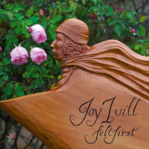
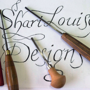
Lettering with a V-tool is easier than it looks, and every carver should have at least one of these chisels. The two signs here are carved in a flourishing italic font which I think is very suited to this technique. I used the same two V-tools for both, a 3mm no.15 (45°) V-tool, and a 3mm no.12 (60°) palm Vtool.
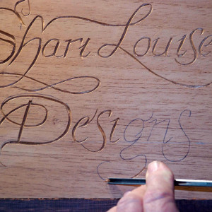
The sign in red cedar below depicts lettering only, and is a good type of lettering exercise to start with. Writing the lettering to size works for me, however, the photocopier will enlarge the writing to suit your particular project. I wrote Shari Louise Designs in a large sketch book, then overlaid it with a sheet of tracing paper and adjusted the spacing between some letters and evened up the size of a few others. When I was happy with the result, I traced it onto the wood.
After completing the lettering with V-tools I used a detail knife, a Pfeil no.11, to tidy up the letters where needed, particularly the ends. I then used a fine paintbrush to apply gold acrylic paint to the incisions. The second sign in myrtle was for a felt artist who specialises in fashion scarves and hats. I designed an Art Deco style sign of a woman wearing a cloche hat and a long billowing scarf to catch the eye and illustrate the felt creations of the artist. I drew the design directly onto the board and bandsawed the profile, then used conventional carving chisels for the relief work. Very little sanding was carried out.
My instructions were for a spontaneous feel, and the words ‘Felt maker’ had to be smaller than the name. Accordingly, I drew the lettering directly onto the wood after writing it in a large sketchbook first and making any necessary adjustments. I tidied up the pencilled lettering on the sign with a rubber and pencils then carved the lettering with the V-tool and detail knife I used for the other sign above. The incised letters were highlighted with a black marker. Both signs were lightly sanded then finished with a few coats of Feast Watson Floorseal.
V-Tool Tips
- Maintain V-tools at peak sharpness—slicing easily through newspaper is a good test.
- Don’t use timber which is too hard—the more force you need to use, the more likely you are to slip into an overrun.
- Practise first. This applies to all the techniques described here. Use a board of the same timber you will be using and execute a range of straight lines, and shallow and tight curves.
- To maintain control it’s important to keep your hand in very firm contact with the surface of the wood while gripping the chisel close to the blade.
- Keep the V-tool vertical taking care with curves and not leaning like a motor bike around a speedway corner. The V-tool will crush the outer curve on tight corners if care is not taken to keep it from leaning into the curve.
- Cut smoothly and avoid rocking horse cuts.
- It is fine to cut the tight corners lightly then go over them, in fact you can do this all along if you like to be sure. Use the wider angle of the palm tool to open up cuts where appropriate.
- The path of a letter will lead the V-tool into changes of grain direction. Pre-plan your cuts so letters may be completed with a number of cuts in opposing directions to counter the effect of an edge cutting against the grain.
- Prepare the background before carving lettering. In the examples the surfaces were first planed smooth.
Knife work
Lettering with a knife is very effective and some carvers specialise in this style very successfully. Excellent results can even be achieved for large deep and bold letters.
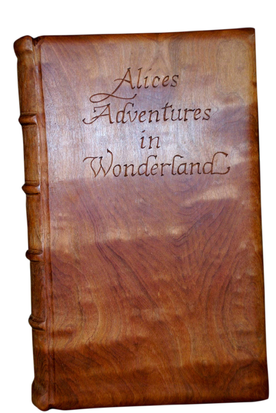
The Alice’s Adventure in Wonderland example I carved is actually the base that one of my carvings, the White Rabbit character from Lewis Carroll’s masterpiece, is mounted to.

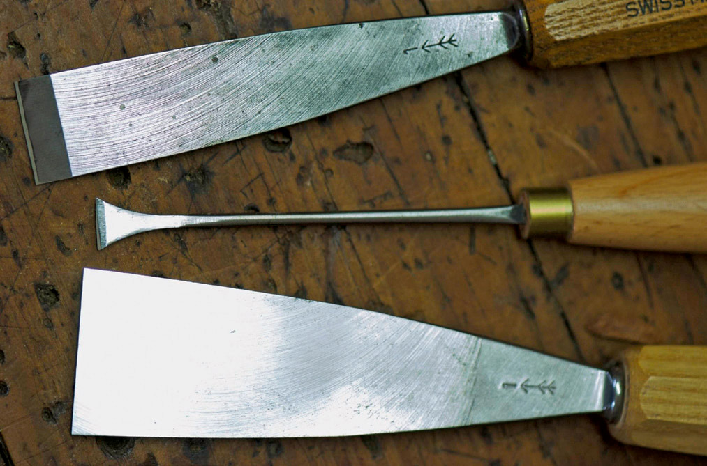
These three knives were the mainstay for the lettering projects.
The ‘book’ was carved from myrtle and fine sanded before I carefully drew the words in pencil. The lettering is not strictly following a particular font, but I played around with it until the right look was achieved. In this case I had the book mounted on a ball vice. The grain of the wood has to be considered and the direction of the cut made with the grain to prevent splitting. Some letters may require several changes in direction and if you are able to easily swivel the carving around the job will be facilitated. The letters in this case did not need to be deeply incised, but they did need to be very neat. I used a very tiny flattish chisel to cut the small serifs and the ends of letters. I usually sign my work with my monogram which I also carve with this method.

Knife work tips
- Once again keep tools extremely sharp.
- I generally use knives of the kind shown above left with shortish blades that are slightly angled.
- Basically, I use two positions depending on the grain direction. When cutting towards oneself the knife is gripped with the thumb beside the blade and in firm contact with the surface of the wood. When cutting curves the blade pivots on the side of the thumb which is pressed into the wood. When cutting away the hand is still pressed to the surface of the wood and both thumbs are behind the blade powering the cut.
- Cut the centre line of letters first, then slice into the centre line from both edges or walls of the letter to form an incised V.
- Good lighting is critical.
- It’s important to mount projects so they can be readily swivelled so each cut can be made from a favourable position. In some cases the project can be hand held.
Relief carving
Raised lettering is another way of saying letters carved in relief, and this style offers plenty of scope. You can choose from a large variety of letter fonts to produce a dramatic and highly visual effect which is especially practical for outdoor signs. On the whole letters can often be fairly quickly carved with a somewhat forgiving technique.
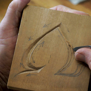
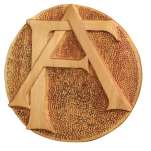
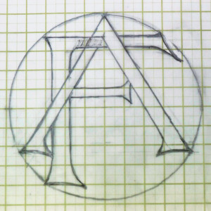
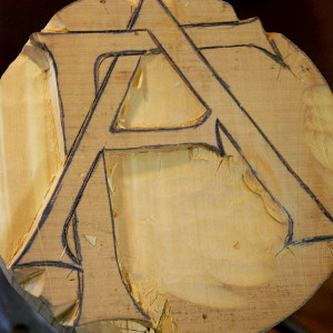
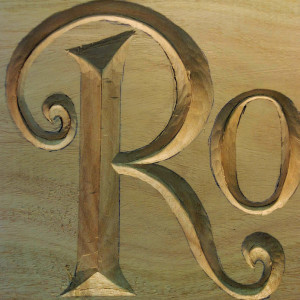
Monograms styled as logos are interesting to design and carve. Favourite words or talismans can also be effectively carved in this way. The monogram shown above was carved in Huon pine as an example. The lettering is framed within a circle that was drawn to size on graph paper as shown. It pays to draw the parts of letters that are covered (as the stem of the F is), to ensure the parts line up properly in the finished piece. After the design had been transferred to the Huon board the 125mm diameter circle was cut out on a bandsaw and mounted on a carver’s ball vice.
Note that the letters AF are made up from straight lines, apart from the serifs. I cut in the outline with no.1 flat chisels 40mm, 25mm and 15mm and a mallet except for the main vertical of the F which ran straight along the grain. The wood was only 15mm thick so I cut those lines with a knife. I then lowered the background 6mm using chisels in nos. 4, 5, and 6. The closed-in section of the letter A was dealt with using bent skew chisels, as was the section between the thicker oblique A stem and the end of the upper F horizontal arm.
When carving raised letters, fine edges like the points of the serifs can be fragile and subject to breaking away. I used stop cuts around the ends to counter this. The curved edges were cut in with a 12mm no.5 fishtail.
The faces of the letters were lightly sanded and the lowered background stippled. I made a punch from a very heavy nail by filing the point to a suitable rounded shape which I then polished. I finished the monogram with tung oil and mounted it on a African blackwood backing.
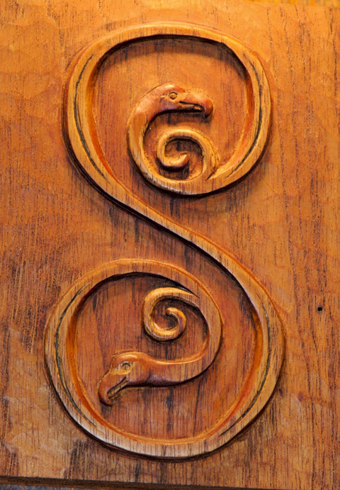
As a further illustration of raised letter carving, I carved the example below in a Lindesfarne or Celtic type lettering once used in the writings of monks and scribes. The letter used at the commencement of a chapter or verse was often beautifully drawn and detailed with interwoven decoration. These letters can make lovely stand alone decorative panels if carved well. I have done a simple letter S version here. I drew the letter on a sketch pad and transferred it to a block of red cedar measuring 70 x 80mm. I outlined the letter with a 6mm 45° V-tool then used a markingout knife to reinforce the cut in the bottom of the V-trough. I cut the outside background down 5mm using a 25mm no.5 and 12mm no.6. The side of the S curves, upper and lower, were lowered using a no.3 firmer chisels in 9mm, 6mm and 4mm. A 3mm no.11 spoon bent and detail knife was used to expose the smaller curved details and the bird heads.
Intaglio

This style of lettering suits larger work. Each letter is recessed so the bottom is flat and the sides are vertical. I used this style for a sign that now resides in my studio. I had a few rough cut 1360mm long boards of walnut—a species I’m partial to carving. I planed the board and sketched the words on.


Experimenting with letter size showed me best how to fit the words in one line. I drew base and letter cap lines on the board 120mm apart and referred carefully to my drawings as I sketched the words directly onto the board in pencil. In retrospect it would have been much quicker and more accurate to draw the sign on paper where corrections can easily be made before tracing the finished lettering onto the board. Flat no.1 chisels in 40mm, 25mm, 15mm and 12mm sizes were used for the straight outlines. Nos. 3, 4, 5 and 6’s cut the curved outlines. A stanley knife with a hooked blade that I use for leatherwork also proved useful for cutting outlines inconjunction with the chisels. This is a very strong knife with a thin blade that’s comfortable to hold and easy to control. The letters were cut to a depth of 6–7mm.
Front bent skew chisels and firmer chisels removed the interior of the letters. A flattish bent skew or firmer flattened the base of the recesses. A small 4mm fish tail shaped the serifs. Once the letters walls were vertical and clean cut and the recesses flat and neat, gold acrylic paint was applied. When the paint was dry the surrounding board was sanded to clean up paint overruns.
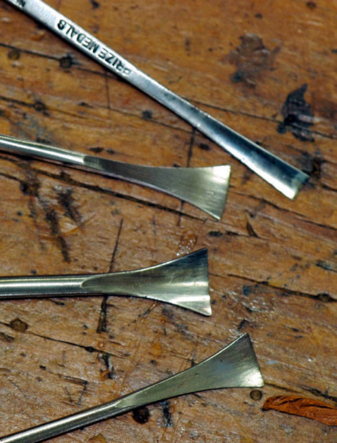
Letter carving tools

Bent skew chisels and grounders for carving the interior of the letters intaglio style.
I used these three flat chisels for straight line cutting.

Tools at hand for incised carving.

Slightly bull-nosed chisels are good for carving the curves of incised letters.
These four fishtails are always on the bench handy, and are perfect for carving the serifs.
Incised lettering

The incised letters on the sign above were carved in white beech with traditional carving tools. The design was first sketched and the final result enlarged to the required size on a photocopier. I then overlaid this with tracing paper and made some adjustments to achieve a balanced look. Tracing paper is ideal for this—I know I have skipped this step and paid for it before. The final tracing was then transferred to the board with carbon paper. With this in place you go over the letters and pencil in the centre lines. You can also mark serif cuts and stop cuts where potentially fragile edges are encountered. The tails on some letters were drawn in as a guide.
The straight centre lines are cut in vertically with a no.1 chisel and mallet—the widest possible chisel gives a more even centre cut. Note where the centre cut ends and serif begins — don’t let the centre line cut into that area. The sides of the letters are cut to slant into the centre cut at the same constant flat angle, taking care not to lever the chips out and damage the edges.
The serifs were cut with a 12mm no.5 fishtail. The chisel is reversed, the corner placed at the tip of the centre line and the chisel sliced towards the tip of the serif. A flat fishtail cuts across the top at an angle to finish the serifs with a sharp cut. Cut the centre lines of the curved letter forms with a chisel which matches the curve. The outside is slanted into the centre line with the same chisel and the inside edge works with one stop flatter and cut with the chisel reversed. Bull-nosed chisels allow you to slice along the curves, avoiding cutting against the grain. The curved tails required more chisels to match tighter curves and more concentration to carve them neatly. Drawing guidelines before cutting with matching fish tails helps.
The letters were painted gold. A light sand removed any excess dry paint. I then went over the letters and sharpened up any serif points which sanding had dulled. The coffee cup and saucer was traced on and then carved into the board. Finally, a more simple but effective example of incised carving is the sign I carved for my studio entrance in Huon pine measuring 350 x 180 x 15mm. The lettering is derived from a versal style Roman lettering that has ‘waisted’ vertical strokes. This style is clean cut, provides good shadowing and is straight forward to carve.
Experimenting with different types of lettering builds up an understanding of the aspects and enormous potential of this field of carving.