

Graham Sands: Shades of Light

Above: The pendant light was designed to suit the mid-century style and Japanese influenced architecture of the house.
Words: Graham Sands
My late partner Gabrielle’s father Bill Carati designed and built the house shown here towards the end of the mid-century modern period, in the late 1960s. It fortuitously became available when we moved from Perth here to Titirangi in New Zealand in 2008, where Gabrielle was from.
Bill was influenced by Japanese architecture. He incorporated features such as cedar shoji screens, built-in furniture and split levels defining spaces within an open-plan in many of his houses, here in Titirangi and throughout Auckland. All the joinery, doors and floor are made from New Zealand native rimu and matai with Douglas fir exposed rafters and cedar window sashes.
The original 1960s light fittings had long-been unsympathetically replaced by previous owners. I’ve always appreciated tasteful and effective domestic lighting, often overlooked or disregarded due to lack of knowledge. Both Gabrielle and I admired the light fittings designed by Isamu Noguchi, George Nelson, Paul Henningsen and David Trubridge from New Zealand. We often used the Chochin style paper and bamboo lanterns back in Perth.
However, to fill this large and poorly lit space I wanted a pendant that would provide a substantial output of soft diffuse light. Also, I wanted it to be visually appropriate within the house.
For years I devised and considered methods to make a suitable, bright pendant light without it being overpowering. Previously, as a professional photographer, I used light tables, which use opal acrylic as a diffuser to back-light transparencies. This gave me the idea to use it as a diffuser and prime structural element of a pendant light, making it easy to construct. I would use this instead of the washi paper found in traditional Japanese light fittings.
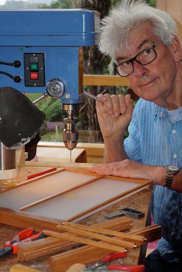
1. The author drilling for bamboo pins in one of the corner rimu pillars with acrylic panel in place. Photo: Gabrielle Carati
Construction
After some research I sourced satin snow acrylic which has a satin/matt finish, much more appropriate than the gloss of the opal. It was only available in 6mm which was ideal for structure and has a beautiful translucency.
New Zealand native rimu (Dacrydium cupressinum) is a conifer harvested here extensively for use in the building industry and for furniture but has now become scarce in supply. It is now protected by law, however I have acquired a precious small amount over time, as I very much like its colour and grain pattern. It has a uniform texture, is durable, resilient and of course is the same wood used in the existing joinery of the house.
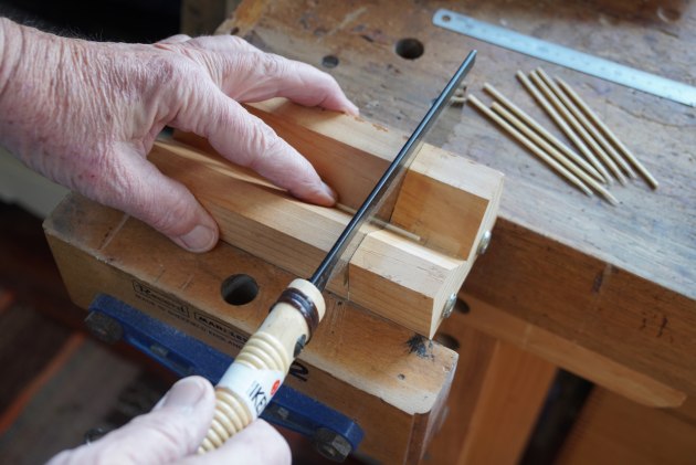
2. A simple jig was used to dock the bamboo skewers used fpr pins.
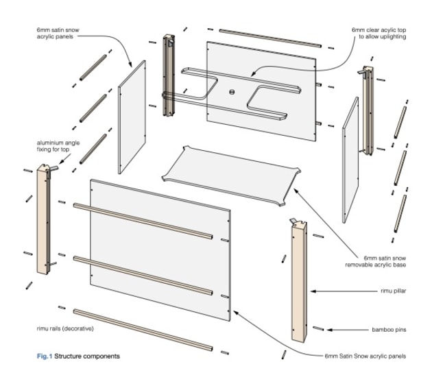
The main body of the pendant comprises four rimu corner pillars machined with grooves for the edges of the four acrylic side panels and pinned in place, that’s it!
The 6 x 8mm grooves were routed in the internal faces of the 30 x 30mm rimu pillars and the internal corners were chamfered at 45˚.
In keeping with the Japanese theme, I used 2.5mm diameter bamboo skewers (from the supermarket) cut into lengths (with a Japanese saw) for pins to hold the acrylic in place, friction fit, no adhesive. The pins are a length such that they protrude, allowing disassembly, and as a design element.
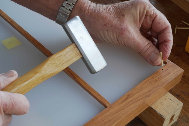
3. Tapping in the pins which lock the acrylic panel to the rimu pillars.
The 6 x 6mm horizontal rimu rails are held in place at their ends with bamboo dowels. They are decorative only, to relate to the leading lines of the room and provide the Japanese lantern look. I seriously considered not including them for a more honest minimalist appearance.
The bottom satin snow acrylic diffuser panel for soft downward illumination rests on four projecting bamboo pins at the bottom of each corner pillar. This allows it to be easily removed for bulb changes and cleaning its upper surface from dead insects and the like. There is a 20mm gap all round for air circulation.
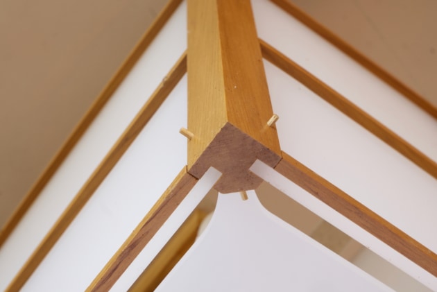
4. Showing the corner junction construction.
The top panel is fixed with aluminium angles to the pillars to provide rigidity and attachment of the bulb assembly. It is clear acrylic to allow maximum, direct uplighting to the ceiling then reflection softly into the room. And it allows ventilation.
The pendant is suspended with four fishing tackle wire leaders to a rafter in the room. They are strong and so thin; barely visible they make the pendant look like it is floating on air!
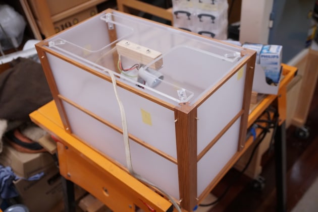
5. Assembling the pendant light.
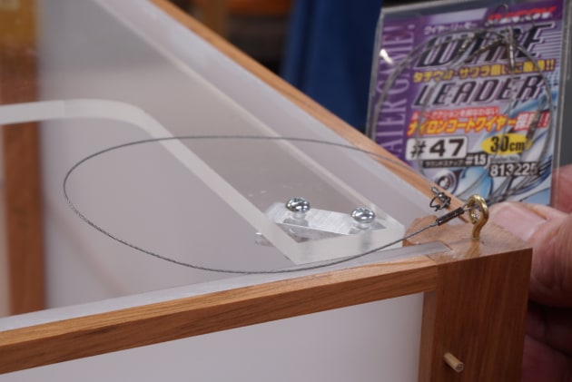
6. Fishing tackle wire leaders were fitted to the corners to suspend the light.
Illumination
I shaped an aluminium bar to support four ES bulb holders for extra brightness and to avoid a hot-spot caused by a single bulb. This wiring is optional and must be made and checked by an electrician.
I am fastidious about the quality of light so bear with me here while venturing far from woodworking jargon.
- Colour Rendering Index (CRI) is the evenness of emission of colours throughout the spectrum, as a percentage quality compared to sunlight. The Sun, and old filament type bulbs are 100CRI. New LEDs are not! They vary a lot, a CRI of over 95 is acceptable, 98 better.
- Colour temperature is the warmth or coolness of light, it is measured in Kelvins (K). Daylight is between 5000K and 6500K. For an internal living environment, a warmer light of 3000K is more comfortable and pleasing to the eye.
- Brightness is measured in Lumens (lm)
- Wattage (w) is energy consumption
- ES is Edison screw
I compared four 6w 3000K 95CRI 600lm ES LED bulbs to four 20w 3000K 95CRI 2800lm. The 6w (equivalent of old 60 watt bulbs) was fine for the space, the 20 watt very bright. I have the option, to interchange them, or replace them with dimmable versions, now available.
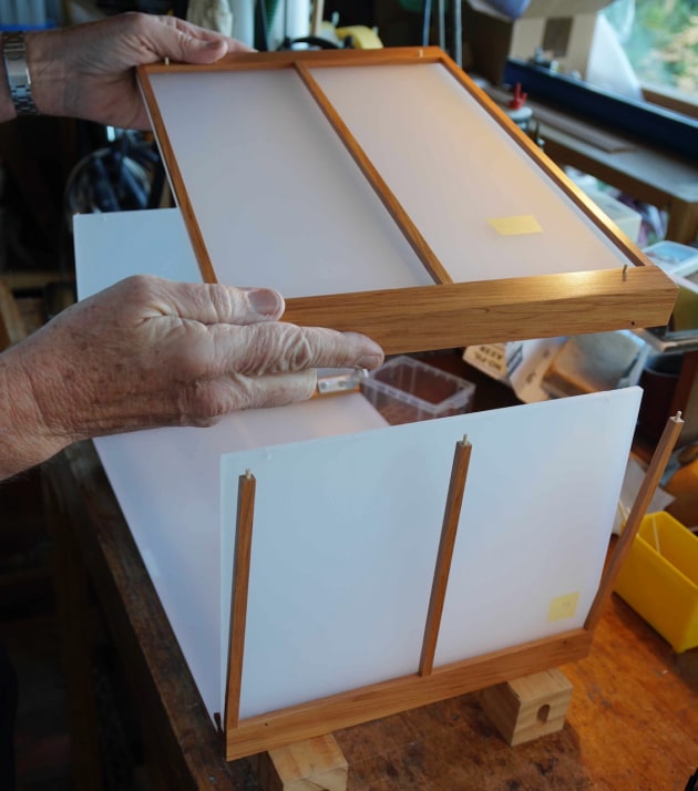
7. A view of the top panel fitted.

8. Showing the arrangement of ES bulbs that create a diffused light.
Finishing off
A simple treatment only is needed to seal and protect the rimu components. I used a clear satin polyurethane.
Main image: Koën Conway
Process photos and illustration: Graham Sands
Graham Sands lives in Titirangi, New Zealand. He is illustrator for Australian Wood Review and creates the exploded and dimensioned diagrams regularly seen in the magazine. He has also written articles for AWR several of which can be seen at www.woodreview.com.au