Breaking the Golden Rule

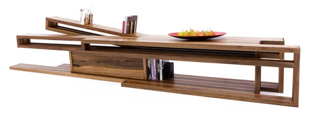
While the so-called ‘Golden Ratio’ might be a rule worth breaking, Melbourne-designer Bryan Cush creates his own modules and ratios of repetition to create visual coherence and points of interest in his pieces. This is the ratio breakdown for his Tetromino unit. Photo: Northside Studio
Words: Bryan Cush
From Da Vinci to Le Corbusier. From Mozart to human DNA molecules. The Golden Ratio (1 to 1.6180339887) has been referred to as anything from ‘God’s fingerprint’, to the pure mathematical formula to defining beauty. I however, have always remained staunchly in the camp that good art and design should challenge us rather than simply conform. It is therefore important to study and understand ‘rules’ such as the Golden Ratio so that we can learn how to challenge, and ultimately break free from them to create unique work.
From the outset, let me make it clear that this article is not an attempt to debunk the Golden Ratio or Fibonacci sequence as being the stuff of myth, legend or pure coincidence. This piece instead reflects my personal experience of why I have found the ratio to be unnecessarily restrictive in the way in which we design 3D objects such as furniture. It is totally irrefutable that the human eye is drawn to various forms of symmetry, repetition and scale, but I dispute the notion that designers should be educated to follow a single ratio to achieve balance and composition in their work.
Scrolling through the thousands of online composite images of the Golden Ratio spiral diagram overlaid onto the Mona Lisa, Vitruvian Man, corporate logos and cutaway sections of seashells, it is obvious there is widescale evidence for the ratio being a potential driving factor behind their appeal.
However, while the overlay spiral diagram may work on flat, two-dimensional paintings and graphics, once it is projected onto a 3D form, that is when I believe it can become slightly problematic. It negates the fact that we rarely experience 3D objects in a true, flattened elevation view, but instead it is always with constantly shifting levels of perspective and view angle. The skewing effect of perspective might be reduced in the case of large, monolithic architecture such as the Pantheon which sits in vast open spaces. However, it certainly becomes a factor with pieces of furniture due to the reduction in scale and viewing distance which will rarely provide a true elevation.

An example of an offset, non-symettrical ‘stitch’ detail on the author’s Sudare cabinet. Photo: Bryan Cush
The main issue I have with the Golden Ratio is that I find 1 to 1.6180339887 just a bit clunky for my own personal taste. It might be predetermined to work as a good baseline and starting point but to my eye it just feels too conservative. At some point as a designer, you develop your own eye and beliefs about proportion and scale. My work tends not to conform to any strict ratios, but instead features various modules of related lengths which repeat and reappear in different areas
of the composition.
The design for Bryan’s signature Ostberg bench shows how key points of interest can be offset and a non symmetrical approach used. Photo: Jo Cush
An analogy for breaking the boundaries of standard ratios hangs on the walls of our living rooms. Flatscreen TVs follow 16:9 screen ratio but in cinemas the format enlarges to 2.35:1. The widescreen ratio increases the dramatic effect of landscapes in cinemascope but the cinema goer’s brain also subconsciously recognises that the ratio is something foreign to their everyday experience. It makes them sit up and grabs their attention. I don’t want my furniture design to feel familiar and safe like that home TV screen, I’d prefer it to try to push towards more cinematic qualities.

An early sketch concept for the Ostberg bench.
So what is the alternative?
The tutoring during the formative months of my first year of architecture school was heavily focused on analysing and attempting to understand how space can be sculpted using compositions of basic 2D shapes. This has stuck with me in the way I approach design today. We’d explore the relationships between shapes using simple figure- ground diagrams or cardboard cutouts. Do they enclose, shelter and protect? Is there tension or a quiet harmony between them? What positive or negative spaces have been created?
In the early 2000s, when I commenced my studies, it was still an era when CAD technology was primarily viewed as a documentation tool rather than for testing conceptual designs. The generation of ideas was still developed in sketchbooks and further explored through physical model making. Today all my furniture spends considerable time being tweaked and documented in a computer, however I still rely on the old-school teachings I received to generate that initial spark and concept.
Classical Greek and Roman architectural ratios, orders and proportions were drummed into us at university but we were also taught that if we wanted to break a rule, we shouldn’t just creep past a ratio by 1%, but rather, shatter it by 1000%. If you wished to make something appear tall, then make it bloody TALL! Narrow its base. Extend the height. Elongate the form using slender, vertical, linear elements. I have found that utilising this approach results in a more elegant and poetic piece, rather than a safely proportioned one.
Strategies for Design

1. Diagramming. Popular among architects to help convey complex ideas in bite-size, easy to understand sketches – a good example to have a look at online are the iconic diagrams that Danish architecture firm BIG (Bjarke Ingels Group) create for every project.
A great exercise to test whether you have achieved the right balance between immediate impact and coherent design language is to show your concept design to someone for 10 seconds and then ask them to do a quick diagrammatic sketch of what they just saw. If they can’t sketch it, it is either too cluttered, too complex or, worst of all, just not memorable enough.

2. Dynamic manipulation. Once you have created a basic composition of shapes and forms that you are satisfied with, try applying dynamic manipulation factors to the arrangement. Twisting. Pinching. Folding. Bending. Snapping. Tilting. The use of emotive and descriptive adjectives as part of the sketch design process can subtly drive the piece to become more dynamic at a subconscious level.

3. Off-centre focal points. I tend to avoid simple mirrored symmetry in my work unless I want to emphasise a powerful centralised feature in the piece. I find that by offsetting counterpoints of interest it encourages the viewer’s eye to
be naturally drawn, allowing them to fully explore the piece. Consider the way a photographer applies the ‘rule of thirds’, where the subject is always offset away from the centre of the image. The simple act of offsetting a gum vein or feature in the timber, in an otherwise symmetrical piece, can act to improve the aesthetic balance.
4. Layers of complexity. Think of your work as a multi- layered design that reveals more of itself when viewed from different angles and distances. Avoid it becoming a one-trick pony by offering to reveal something more upon a second viewing. Whether that is an interesting structural detail, or a hidden nook – keep them coming back for more.

Useful as an initial design tool: conceptual modelling to test a form for John Wardle architects’ Somewhere Other Venice pavilion.
5. Physical model making. I cannot stress enough how useful rough, conceptual model making (as opposed to finely crafted) can be early on in the design process for resolving issues that aren’t making sense in a sketch book or a computer. Just use whatever materials you have at hand – corrugated cardboard, timber offcuts, grab a hot glue gun and get making. Design solutions often reveal themselves just by the act of using your hands to sculpt a 3D form.
6. Avoid over-researching other furniture designers. Being inspired by other designers is fine, but be careful not to fall into the trap of replication and ending up creating homogenised work. To avoid this I tend to look towards other disciplines such as sculptors, architects, artists and even chefs.
Bryan Cush is a Melbourne based furniture designer and maker who has written for Australian Wood Review magazine. Learn more about Bryan at www.sawdustbureau.com